As Jaguar’s bold new look continues to split opinion, we look back at the best (and worst) automotive rebrands. New or old? Cast your votes now.
Nobody saw it coming. One of the car industry’s most traditional brands has torn up the rulebook and started afresh from page one. But, whether you like Jaguar’s clean and minimalist new branding or not, it isn’t the first marque to undergo an image overhaul.
From badge updates to complete name changes, here are some of the most radical automotive rebrands. Were they a much-needed masterstroke, or did they throw the baby out with the bathwater? You decide.
Eclipsing Datsun: Nissan’s name change (1984)
One of the more comprehensive (and famous) brand evolutions: up until 1984 Nissans were sold as Datsuns in most of the Western world. Then, in a move to elevate the nameplate and cut ties with a value-led reputation, Nissan went the whole hog and updated its logo, slogan, and badge to reflect its new, more premium aspirations.
And it seemed to work: Nissan’s lineup now regularly features in the UK best-sellers list. Although, strangely, the Datsun badge has since made a comeback in some emerging markets. But that’s a story for another day.
Designed to celebrate the firm’s storied 210-year history, Peugeot’s new logo harks back to its 1960s emblem. Focusing exclusively on the powerful lion’s head, the contrasting crest was well received by press and public alike — as were the handsome cars which wore it.
Back to basics: BMW’s transparent roundel (2020)
Launched just weeks after the global COVID-19 pandemic took hold, BMW’s new logo (understandably) got a little lost in the news cycle. However, for those of you who missed it, the Bavarian marque’s updated roundel drops any 3D effects or chromed elements to “radiate openness and clarity”, according to Senior Vice President, Jens Thiemer. Was it a success? You decide.
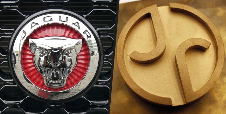
Goodbye Growler: Jaguar enters a new era (2024)
Since the arrival of the XF saloon back in 2008, Jaguar has tried time and time again to appeal to a younger clientele — without alienating Jag loyalists in the process. And, while those efforts returned mixed results, the British firm has now decided that a seismic shift is in order.
In a move that’s shocked many, Jaguar has ditched the beloved growling big cat emblem for a simple, mirrored J design atop a gold medallion. And that’s not all: the Jaguar script has been softened, while a new warmer colour palette and unusual, sci-fi-esque costumes featured heavily in the premiere advert.
It certainly takes guts to meddle with an iconic design, but will the bold rebrand pay off? Only time will tell.
Hero image credit: Shutterstock / Jaguar